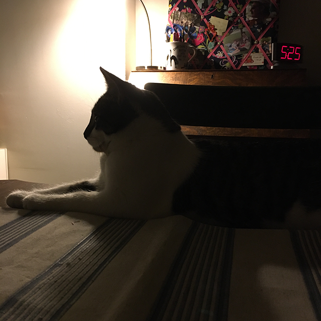
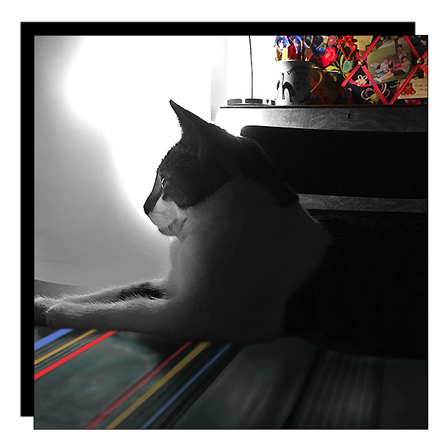
I liked this photo of June, taken at dusk one early winter evening. But I also "disliked" it, feeling it did not have the interest or drama it could have. Reworking an image with Photoshop does not always make it "better", but rather just makes it different. So, I'll let the viewer decide about this image ... below, how it was altered:
1) crop and slightly rotate
2) outline all of the image excepting bulletin board on desk
3) convert outlined area to grey scale/black and white
4) enhance, strengthen color values on the bulletin board
5) pick up colors from bulletin board to "stripe" the placemat
6) using the dodge tool to highlight June's face/profile and
brighten the area behind her profile
7) tighten crop, add black shadow border
Different? More interesting? More dramatic?
Even if none of the above, a fun exercise in Photoshop.
And guess what else is fun? OCTOBER! For us it means that Zoolatry becomes BOOLATRY, a tradition here for more years than I can recall, so hope you'll be joining us. Lots of "flashback fun" ... frivolous friends ... spooky, scary, but sweet meows 'n' woofs all month long. And tomorrow, October 1, it's a must to visit The Cat Blogosphere, check out all the events for the month, grab any badges you want, and get ready to "boo ... "
Athena Cat Goddess
for the
Caturday Art Blog Hop!


the edited one is my favorite, all of it. I do like the first one with the glowing clock and it is misterious. not one to frame or put on a canvas, but the edit would be beautiful on canvas and the wall
ReplyDeleteLove the re-worked photo! Happy Saturday!
ReplyDeleteNow that picture is even better!
ReplyDeleteWhat a cute picture of June. You worked your magic on it.
ReplyDeleteThe edited one is my favourite because it brings out June's face.
ReplyDeleteDark and mysterious...
ReplyDeleteI like the original better. It gives the feeling of warmth on a cold winter night.
ReplyDeleteWow, that turned out really nice. We always LOVE Boolatry!
ReplyDeleteReally cool exercise in editing! Visually I prefer the second image, because it reveals June's face, and brings out the pops of colour, not evident in the first one. I think both versions have their place in your photography. It all depends on your mood.
ReplyDeleteJune you look lovely in all lights
ReplyDeleteHugs Cecilia
I like both versions of this picture! Though they two entirely different pictures, I find both really effective!
ReplyDeleteI love how much brighter June's face is in the second one!
ReplyDeleteI like the changes. XO
ReplyDeleteThat's a beautiful photo. The lighting, like June, is just purrfect!
ReplyDeleteBeautiful job
ReplyDeleteWe think that turned out wonderfully! We love the artified image, Ann!
ReplyDeleteI do love that glowing lamp in the first image, but I also love what you did with the second one! Hmmm...its a tie!
ReplyDeleteI like both.
ReplyDelete